Fashion stylists work in a very organised manner. They use many accessories and equipments for their assignments, right from their Fashion Styling classes.
It’s necessary for fashion stylists to keep their tools and accessories handy, as they are trained to do at Fashion Styling courses. Easy access to tools and equipments makes their work look professional.
Learning to style at Fashion Styling schools does give the required refinement to the practice. Hence, it’s highly recommended having a formal education in the subject with certification.
Here, we will look some equipments and accessories fashion stylists use for smooth working.
Garment Racks

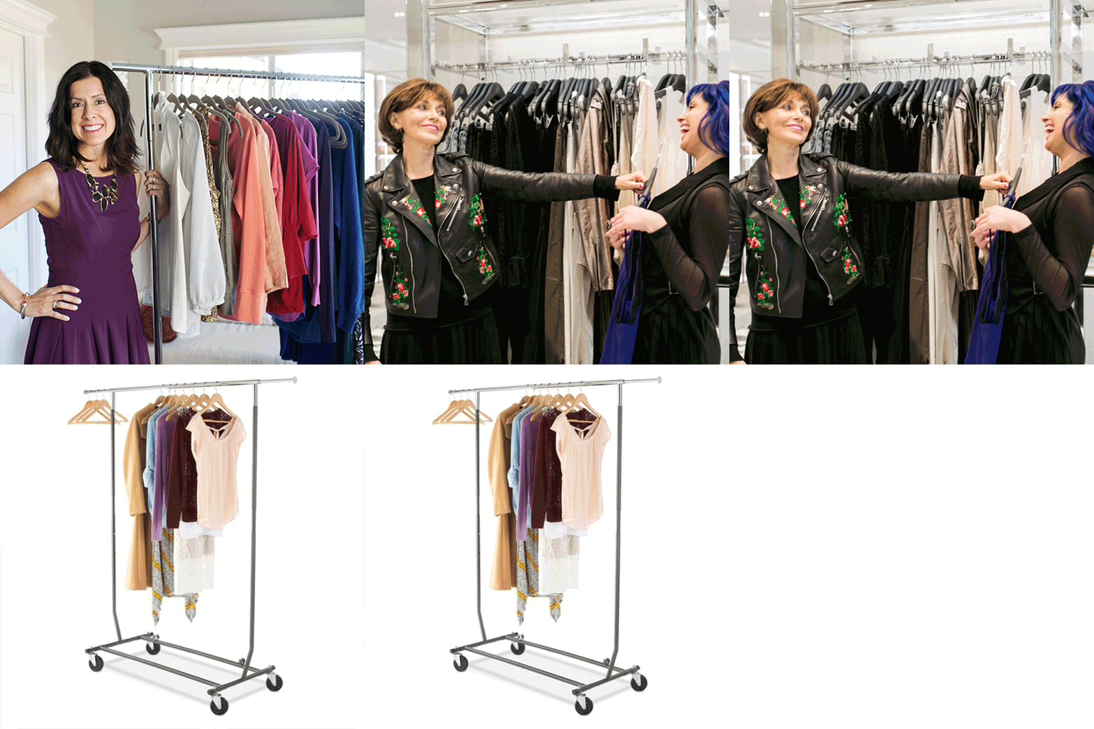
Garment racks make it easy to keep, arrange and segregate garments neatly. It is also movable and hence helps the stylist in keeping order during work.
Steamers

Steamers are important for keeping garments wrinkle-free. Keeping a portable steamer is very helpful on the job.
Lint Rollers

Portable lint rollers help to keep the garments neat and prim. It’s often expected of a stylist to have one handy.
Storage Containers

Arranging garments and articles become so easy with enough storage containers. It helps in avoiding clutter and confusion.
Tagging gun

Keeping a good quality tagging gun helps the stylist to label garments appropriately and make work easy for anybody handling the articles.
So there you go! Let this be a reference point for your styling work whenever you take up an assignment.

