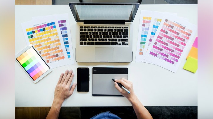
Creating beautiful designs needs a creative mind. Not everyone has the skill to design a layout. This is the job of a graphic designer. They are responsible for all the creative changes and layouts made for the company. This brings us to the colours used by the graphic designer. It is the shades used in the design that play an important role in making the creatives.
Choosing a colour combination for the brand is the first step in creating the face of any company. This will take you one step closer to the growth of the company. You can see big brands never change the colour of their logo. That is because it is the statement for their company. It is a visual form of telling people which brand it is without even reading the name of the company.
Brands like Coca-Cola, Pepsi and many other brands have a fixed colour coding. Like Coca-Cola uses a bright red colour in their logo, Pepsi uses deep blue and so on for various brands. This is because these colours represent their brand’s logo and identity.
Colour coding in a creative graphic design is one of the most important factors in creating a mark in this field. But to master colour coding in graphic design, you need to know a few basic things first. We have listed some below:
Table of Contents
What is Graphic Design?

In the fast-moving world, no one has the time or takes the stain of reading the content that is written. This makes graphic designers the most important part of the industry. They create a visual form of the information, we see a lot of messages combined with images in a single layout, like the products we buy or even the company logos we see around us. Graphic designers are needed in all the parts of the industry, they make logos of companies, posters and banners of all the media-related industries like, TV, movies and even social media creatives too. There are a few logos which have left their mark as the key resemblance of the brand like, McDonald’s with a big bright yellow M-symbol. Now almost everyone knows which brand it resembles. Coca-Cola with a bright red background is the most common drink preferred by everyone today. This makes it more popular among all the other brands. Hence, graphic designing is essential for any brand.
Graphic design meaning is simple, it is the process of using elements, colours, shapes and lines to create graphic messages and logos of the company for marketing it through social media.
Also Read: 3 BOOKS TO READ TO IMPROVE YOUR GRAPHIC DESIGN SKILLS
Understanding Colour Coding

Any colour used in the layout and logos plays an important role in reflecting your brand’s name. No matter if you are starting up a company or already own a small business for designing, the importance of the colour used remains the same. The brand logo has to be catchy and creative so that people stay for a while and see your layout. This will increase the popularity of your brand among the public and will increase the range of projects you get. But choosing the right colour for your brand may be tricky, you have to observe the other brand logos and colours they use in their designs. This will help you decide the colour you can use in your design to make it appealing so people can spare some time to go through your designs.
Colour coding might sound complicated but can be learnt in no time. All you have to do is to join a graphic designing course to learn colour coding from experts.
Also Read: 3 GRAPHIC DESIGNING TIPS FOR CREATING A GREAT LOGO!
Different Colours & Meanings

The meaning of colours varies for different cultures. The impact your brand creates on the targeted audience depends on the colours you use. The interest people show in your designs depends on the colours you choose for your layouts. Here is a list of a few colour codes and its meaning:
Hue:
It is the value of colour which is perceived through the viewer, shades like red, blue, green, purple and many others are bright and poppy. These colours catch your eyes at the point of contact with the commercial or poster you see.
Saturation:
It is the overall intensity and brightness of the colour. The saturated colours are bright and clear and the pictures look nice and vibrant. But if the saturation is low the picture looks dull and desaturated.
Value:
The value of an image depends on the lightness or darkness of colours used in the layout. This is also an important factor in graphic design. Because if the value of colour in the layout is too much then the layout would look too bright than needed, which will disturb the viewer’s eye. Whereas, if the value of the image is too low, then the viewer may find difficulty in seeing the poster.
Blue:
This colour shows security, trust, stability and loyalty to the viewer, these colours give a settled look and a comforting feeling. It is mostly used in posters and banners of companies which need to sell their product like insurance and many other things related to them.
There are many other colour codes like Monochrome, analogue, complementary, triadic and many others. To know all of them you need to learn graphic design from experts.
You can join Hamstech’s Graphic Design course and learn more about colour branding or the importance of colours in graphic design from our celebrity mentor, Kailash Nayak. Enrol now and kickstart your career with us!

