Interior design has many fascinating aspects to it. Among the many factors that make interiors interesting and beautiful, negative space is a very prominent one.
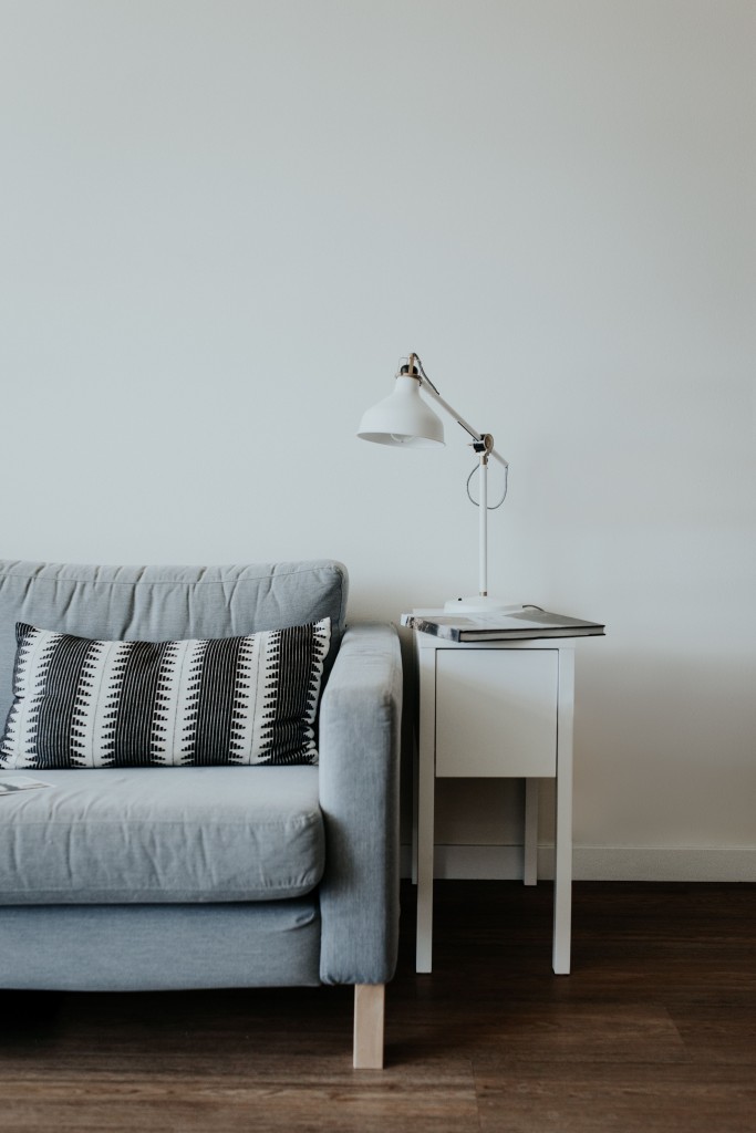
Negative space could either be the area in an interior setup that is not filled with any materials or the blank area around accessories in the interior space. In interior designing, the importance of negative space can be seen in any type of design: from minimalist to the maximalist.
When it comes to visual comfort and elegance, negative space is a good technique to balance the visual gravity between different areas of the room. Beyond the artistic and aesthetic appeal, negative spaces also provide functional advantage by virtue of space available around the elements placed in the room.
Any educated designer will know from his/her interior designing course that without considering negative space, no interior plan can be successful. An eye for detail and flexible layout implemented smartly makes any interior setting worth the effort. If you are interested in knowing a bit about negative space, before you learn it in detail by joining courses for interior designing, please read on.
Blank spaces accentuate objects in view.
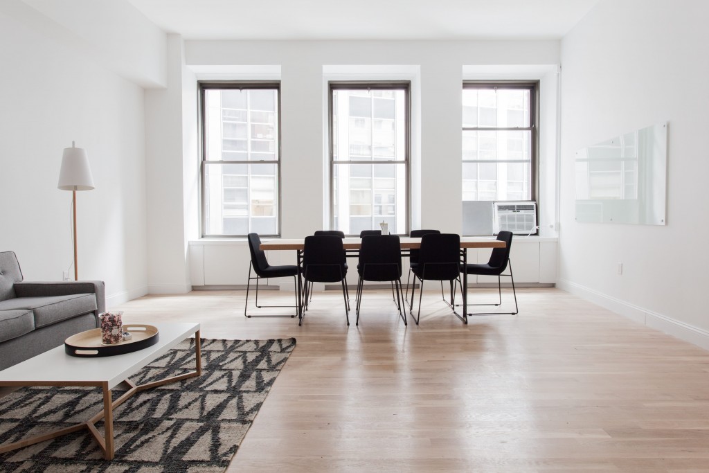
Many a time, focus on the materials in a room comes only by providing a breathing space around them. This is achieved by strategically implementing negative space. Imagine a dining hall where you want to get a nice view of the dining table and probably the decorative lighting. With a blank wall as background, and ample space around the table, this can be easily achieved.
Negative space often gives positive visual content.
A kitchen is the best place to consider when it comes to clutter. Organising cabinets is a creative exercise which can be perfected by applying negative space. Upper areas of the cabinets that are less frequently accessed, can be set as a negative space while the lower areas of the cabinet can be used for storage of frequently accessed materials. This balances the visual noise in the kitchen.
When clear space is the best element in a room, negative space becomes essential.
You seldom think about the most attractive element in a room and will be surprised that it is an empty space that fits that description. Say, a visiting room without a coffee table in the middle or a stair area that is not filled with hang ups or dump can create a greater impression about the space than when treated other ways.
Glass panelled wall-sized windows can make great negative space.
Negative spaces need not essentially be opaque structures like walls. Wall-sized windows opening to outdoor areas like the garden or lawn, can in fact create a feeling of abundant space and can be a great backdrop for any element placed in the room.
So as we have seen, negative spaces have great significance in designing interiors. It makes a great deal of difference when you use blank space wisely to balance and highlight different visual elements at the same time.


