Graphic Designing is an art in itself. After all, it is the craft of creating messages that can be visually communicated. Connecting the viewers from the very first glance is very important and that can be done by choosing the perfect colour scheme and design.
One of the most important and in-demand learning topic in the Graphic Illustration courses is art of designing the perfect logo. It gives every organisation an identity and therefore, logo should be unique.
Let’s have a look at the different designs that are trending in 2019.
Negative Space
Logos that use negative space in a creative way displays simplicity. Using negative space to hide an image or text can add an element of surprise and sophistication to the logo. One of the best examples for this is “FedEx”. The arrow between the “E” and “x” explains that it is about moving objects from one place to another.

Illustrations That Replace Letters
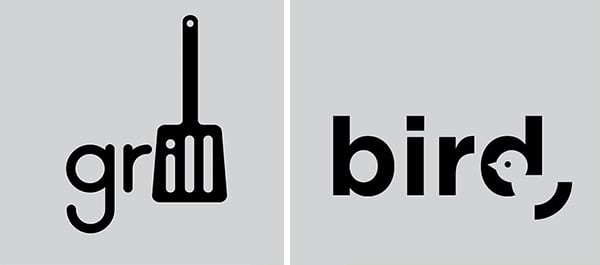
We use emoji as a replacement for words. The same technique is applied for logos as well. Using an animated image in the place of a letter has proved to be successful for many brands. You can make such designs on your own by joining Graphic Designing and Illustration courses.

Gradients
In the past few years, Gradient design has seen an increase in demand. This logo has attractive and striking colours that are used in a way which appeals to everyone. It is very important to choose the colours that merge easily. The Instagram logo is one of the best examples of gradients.

If you are interested in learning the art of Graphic Designing, join Graphic Design Diploma courses at Hamstech and give yourself a chance to learn from the celeb designer who created the award-winning movie poster of Dev-D, Kailash Nayak.

