With New Year, every field gets new trends with a lot of opportunities. As the trends of clothing and styling keep on changing, so does that of graphic design.
But for this year, it seems like old trends are coming back. Because of the past year, people in 2021 want something calm, subtle, peaceful and full of positivity in this chaotic world. Designers will rely more on mute colour palette, serif fonts and things like that which are less risky.
Infographic design can also control the reign which includes a collection of imagery and charts with minimal texts that will give an easy understanding overview of a topic.
So, without further delay let’s analyse the trends which we can get to see this year.
Table of Contents
Elements of Nature
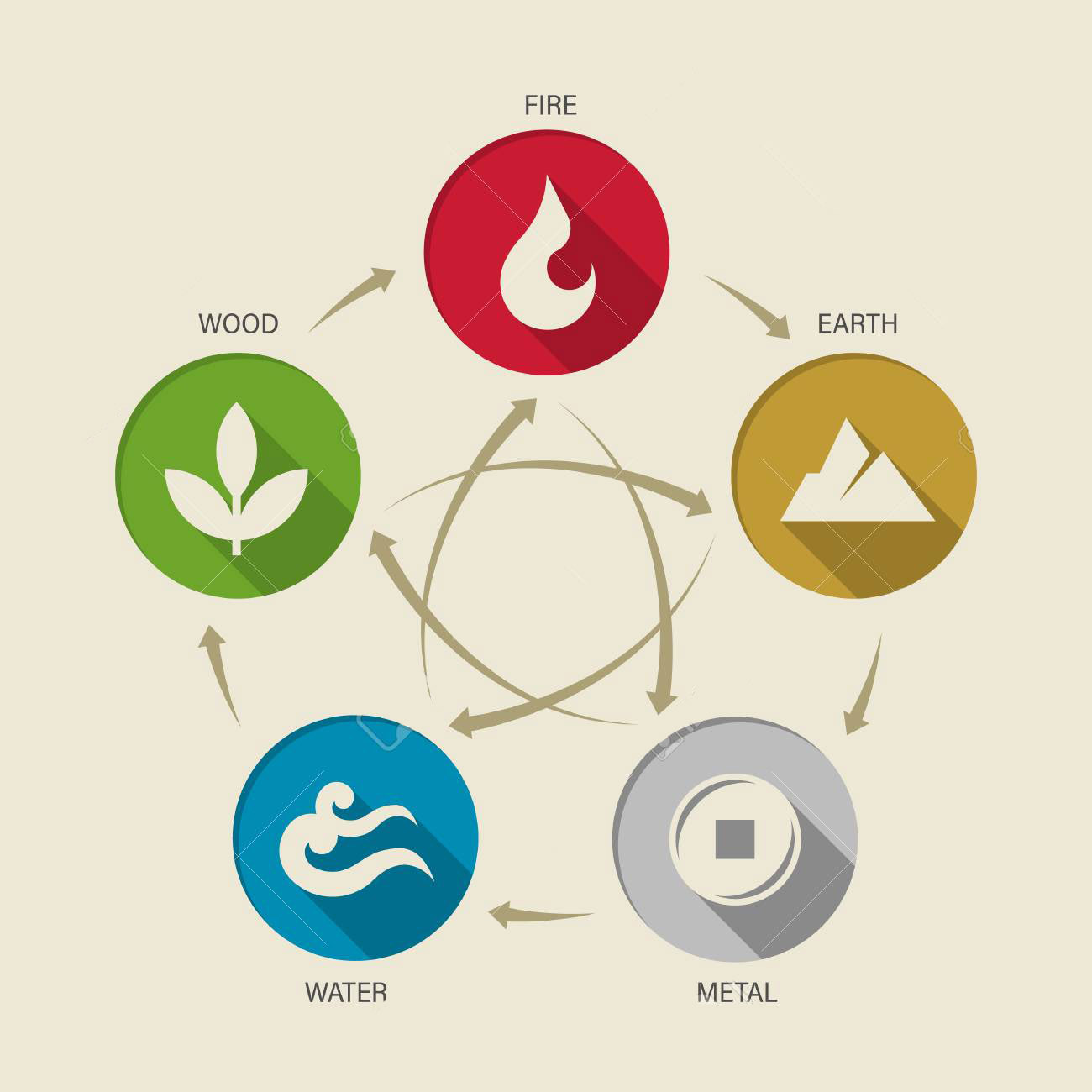
Whether this promotes the use of leafy and floral patterns or earth tone colour schemes, everything is going to be nature and green. Because of one whole year of a gap, people will try to reconnect with nature.
This nature and the green colour trend will convey the message of serenity, renewal and growth- something which we all are hoping for. This will be the trend designers can’t avoid.
Mute Colour Palettes
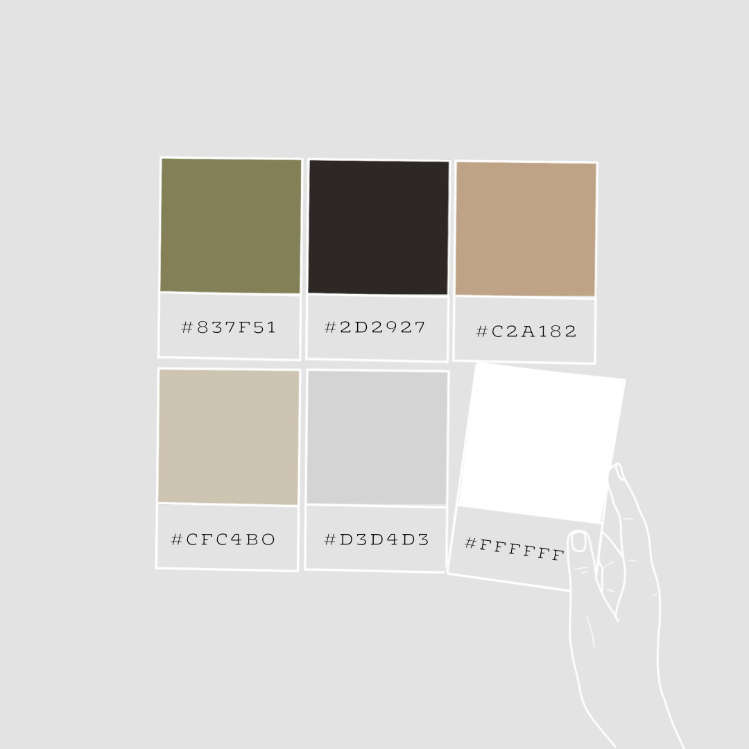
After years of bold and pop-up colours, people will go for something muted and light to get more relaxed. An advantage of using mute colours is that they blend perfectly with the text. No worries if you are using the light font colour, it will blend well. These colours also blend well with dark font colours. Therefore, you have the freedom of choosing whatever font colour you want with a mute colour scheme.
With so much going on over health and wellness, these mute organic colours are perfect for current issues.
Also Read: IMPORTANCE OF COLOUR IN GRAPHIC DESIGNING
Rebirth of Symbols
Symbols are classic whose power is the ability to transcend language and message. New designers are readapting symbols to create inspirational icons of resilience, growth, development and empowerment.
This can be done by putting in recognisable symbols of power like a goddess, lion, stars, moon and constellation, planets or galaxy. The use of European painting at the time of the renaissance is also widely used as a powerful symbol.
Through these classic and timeless symbols, designers are trying to shape the phylactery we will need to remove the monotony and despair in the coming time.
In a design, little things matter. So is the power of the symbol. A single symbol can convey a thousand messages. It all depends on the perspective of the viewers.
Classic Serif Fonts
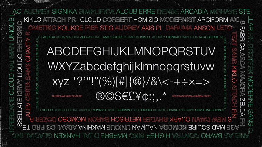
Serif fonts are one of the oldest and most popular font styles that are still in use. People get confused between serif and sans serif fonts. Serif fonts have a sort of embellishment on the starting and ending parts of the letter. On contrary, sans serif have no sort of any embellishment.
These serif fonts can be dated back to the 15th century and are still in use. Because of being this old, they are considered as most classic and elegant font type.
You can this font type with a muted and neutral colour scheme to give a more trustworthy look. To create a great contrast you can use a serif font for the header and sans serif as body text.
Also Read: 3 POPULAR FONTS THAT YOU SHOULD USE IN GRAPHIC DESIGNING
Real but Surreal
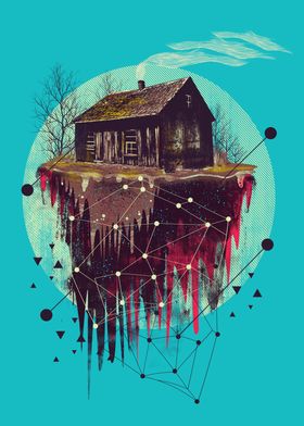
Surrealism is a term that is literary and artistic. It means thinking and creating imagery that is nonsensical and irrelevant. Something real in our imagination but not in reality. Surrealism itself contains realism. Intertwining realism with surrealism is the main concept. 2020 gave a feel of surrealism because of the pandemic of which no one ever thought.
Through the concept of this surrealism, designers are expressing what they felt during the lockdown, making layouts through different and normal images and combining them to make something strange and irrelevant- thinking out-of-the-box.
This is a high concept approach that can be seen more frequently on book covers, posters or albums.
Geometric Shapes
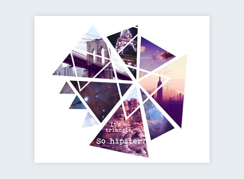
The use of geometric shapes (1) can be seen more popularly in recent times. Last year had the trend of flowing and abstract shapes. But this year they are bygones. Now, the year has changed, the time has changed and so the trend.
Geometric shapes are easy to create and use. These shapes add order, consistency and structure to the viewer’s visual. These are exact and precise that can create many good contrasts when used with muted and natural colours. This makes an eye-catching effect.
You can make these geometric shapes as part of your focal point to make it highlight more. Shapes themselves represent many messages and meanings. So, they can also be used as a part of your symbol to denote something very powerful and meaningful. Now you know there are a lot of ways to use geometric shapes, use them in your designs to make your presentation more effective and structured.
These were some of the many trends that you can see this year. If we summarise this we can say there is an air of optimism with caution. Designers are not thinking much of taking risks and are trying to play safe.
Join Hamstech and learn to use the best Graphic Design Software from industry experts. Enrol now and start the journey towards a successful career with us!


